DTS Play-Fi has been around for almost 10 years now. When we originally launched the app and the platform, our primary goal was to provide streaming of music content stored on the phone over standard Wi-Fi, without degrading the quality, and we did that to the exclusion of everything else. The app was a full screen experience of mostly just picking your speakers and music, and then it would fill up your whole screen with remote controls. It was very basic, but it was a snap to wirelessly stream your music in high quality.
We gradually added more services and features over time, gaining AirPlay compatability, and even expanding beyond music into the realm of surround sound with our original Play-Fi Surround feature, and more. With all that new stuff, our old app started to become cumbersome with all the screens and add-ons, so we had to make a new app with a fresh new UI, and that was released in 2016. If you go back to the first News article on this website, you can see it for yourself.
With some minor touch-ups over the years, we've had that version of the app ever since. We've been adding more and more features over time, and just as before, it became overloaded, and took us further away from that time where music playback was a snap. It was time for something new:
From a glance you can see this is a sgnificant shift from where we were at before, and this is just the main screen. Key differences here are:
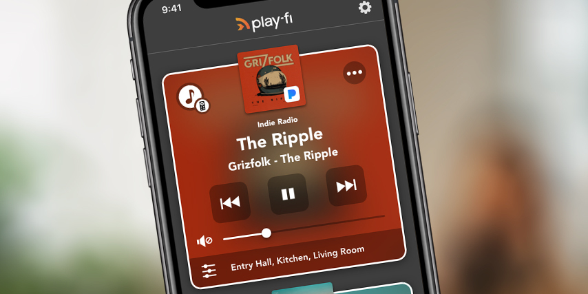
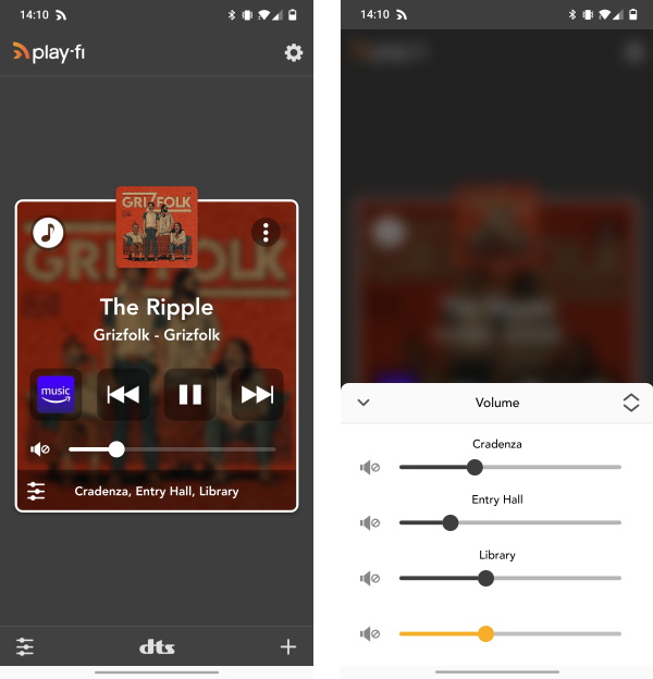
- Main Zone modules are redesigned and simpler
- Volume controls are now accessible through a volume button on the bottom left
- Speaker / Group editing is now available in a button in the middle center
- The + button now brings up the “Start” screen
Long overdue you might say. We've updated much of the core experience to make certain features that we've added over the years a little easier to access, and put some other items in more sensible places to keep the screen from being filled with too many moving knobs and sliders. Most importantly, we've done a lot to visually update the look of everything for a more modern feel that's easier to get to the features and functions you want.
Most importantly, we've tried to make getting started easier, especially if you have saved Scenes (formerly "Presets"):
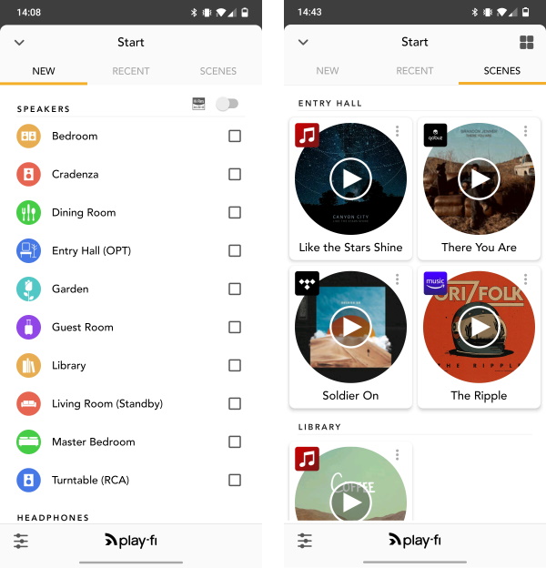
Instead of a bunch of options in a short list hidden in a button most people didn't press all that often, we've now unified all the ways to start playback in the Start screen. It's not an especially creative name, but it makes it super easy to either build your zone fresh, or pick from your favorite content, all without having to open new pages or navigate away. Specifically:
- Now has tabs for speaker / group selection (default), Recent, and Scenes (Previously Presets).
- All extra features that were previously under a pop-up menu are now accessible in the start screen, such as the above-described items, as well as Headphones (available on the bottom), and “Stream From”, which is now an extra option displayed when selecting a speaker that supports this feature.
- Source selection is now full screen and shows all potential sources without the need to scroll.
The Start screen will automatically pop up if nothing is playing, so that you can start music. If you have something running already, whether it's from Play-Fi or from one of our other integrated services, you'll see those zones running, and can tap the + button at any time to bring up the Start screen.
These are the biggest changes, and while there are refinements here and there elsewhere in the music services and behind the scenes, everything will generally feel familiar if you used our platform in the past, so it shoudn't feel like learnign a system all over again.
You'll notice the Play-Fi logo and icon has been updated as well. We've got a lot that's new in the world of Play-Fi today, with our recent announcement of integrating into a wireless surround system for TVs with Play-Fi Home Theater, our biggest UI update in some time, and even more we hope to share with you in the near future.